Nature’s take on poster design:
snapshot of the article. toggle light mode on top left corder so that the text would be readable. read the full article here.
https://aritang.github.io/files/ariana_tang_cv.pdf
The scientific poster remains a crucial currency for communication and connection….Researchers now have access to an array of high-end graphics software — and the ‘how to make a poster’ conversation has been going on for years (see Nature 483, 113–115; 2012)…. Yet, researchers often slap posters together at the last minute instead of thinking about the best ways to deliver their message and engage their audience.
But those who have the vision — and computer skills — to avoid distracting design blunders will draw the right kind of attention to themselves, their findings and their ideas:
“A good poster will help you make better connections, just one conversation can turn into a huge success.” (Anthony Salvagno)
less is MORE
“When I ask people what they dislike about posters, too much text is the number-one complaint—people hate seeing it on other people’s posters, but they do it on their own." (Salvagno)

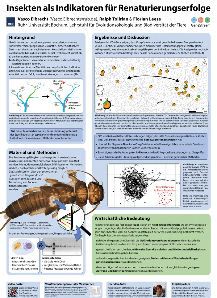
an award winning poster—look at the insect!
Effective posters take many shapes, but they tend to have some basic elements in common. A “stunning” poster generally starts with a gripping centrepiece image, whether of a molecule, organism or galaxy. Be daring—there may be hundreds or thousands of posters at a conference. You want something that will stand out.
The placement of white space is an important but often overlooked aspect of poster design. Visually attractive posters tend to have substantial borders and significant gaps between text blocks. The white space should flow together in a cohesive way that draws in the eye while giving it a chance to rest. In a room full of posters screaming for attention, some well-placed emptiness can offer tranquility.
(Sam Hertig)
right tool for the job
Microsoft’s Office tool kits are great for beginners.
Yet these design aesthetics won’t amount to much without the right software. Many researchers resort to PowerPoint, usually because they already have PowerPoint figures at hand. But PowerPoint isn’t designed for printing, the colours may be off and the alignment tools are cumbersome.
If PowerPoint is the only option, do disable the ‘snap to grid’ function for maximum control of the layout.
Read here for more on graphic design tools for posters. Finally, do remember to practice the pitch speech:
At most conferences, the presenter will have at least a couple of hours to stand by their posters and interact with attendees. This is where some of the most important work at a conference takes place, which is why researchers should spend as much time polishing their pitches as they spend creating their poster.
reference
Woolston, C. Conference presentations: Lead the poster parade. Nature 536, 115–117 (2016). https://doi.org/10.1038/nj7614-115a