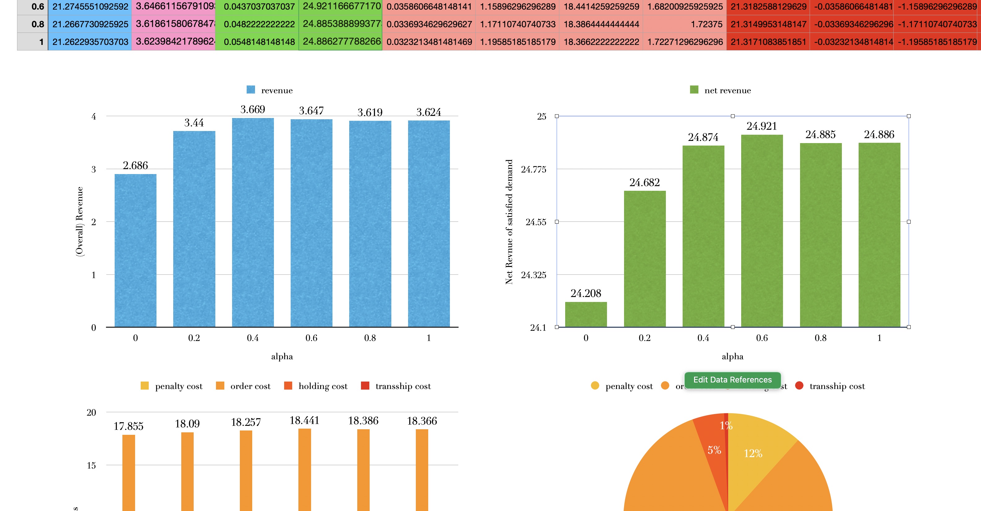
I’ve been doing data cleaning and visualization for my project these days. I would say it’s boring as well as enjoyable, but it’s certainly a waste of time. What’s even more annoying is that none of my teammates are as skilled as I am in this area, so I’ll have to do it anyway.
 hehe. i know i’m good at this - combining my aesthetic and research
What about it then? There’s a saying that data visualization is an art. Hmm, I would pause to re-consider that opinion. People often label everything they find hard to explain or that has multiple criteria for success as an art. Debating this, however, requires tracing back to the philosophical definition of art and the characterization of what exactly data visualization is. Let’s just admit that data visualization is a comprehensive process that involves multiple disciplines: computer science, design, psychology, and whatever else might be relevant.
Anyway, what first comes to your mind when you hear the term “data visualization”? Narrowly speaking, when we talk about data visualization (DV), we’re mostly referring to charts and graphs drawn with respect to numerical data, like an Excel spreadsheet. Often, DV is associated with the tools used to convert numerical data into graphs and charts—Python, Excel, and other software.
My earliest memory of DV dates back to primary school computer science classes. The teacher gave us some formatted course grades in .xlsx and taught us how to draw a histogram based on that data. The data was well-organized and clean, and all we had to do was “click the right positions step by step”—first, locate somewhere in the menu bar to create the chart, then select the correct region in the table, and voilà—here’s the visualization!
That’s it. That’s how you teach primary school kids data visualization. And essentially, that’s still how they teach data visualization today. They give you a readily formatted data chart, teach step by step how to use their software tool, and make the whole process seem effortless, luring you into thinking that those beautifully intricate diagrams can be created with just a few clicks and without much thought or design.
Screw that. It’s impossible.
Principle Theorem. One can never visualize beyond what they can envision.
In other words, there’s no way that you can derive any profound insights from messy data using a fancy visualization tool. You simply cannot conjure logic out of thin air.
Therefore, the focus of teaching and learning data visualization should not be on attempting to master the software but on understanding the internal logic of converting numbers into meaningfully organized pixels. For example, when it comes to Python, instead of trying to thoroughly master the complicated syntax of Matplotlib, it’s actually more important to (1) understand how to format data to fit the visualization tool and (2) know how to read the manual, documentation, or even Stack Overflow.
Matplotlib or any other tools are never superior to one another. But logic and ideas are, and they matter.
Behind any fancy data illustration, there are essential components:
(1) A topic that gives the data real value; otherwise, why not visualize some Gaussian noise?
(2) A mathematical core idea that unveils the data’s intrinsic logic.
(3) Some aesthetics that emphasize the visualization and prevent it from being intolerably unaesthetic.
The suggestion would be to master a data processing technique—whether it’s R, Python, or an Excel spreadsheet. Though the last option might seem inferior, it exists for a reason, and I’ll leave it here. Then, you can process the data and feed it into whatever visualization tool you’re comfortable with—whether it’s those fancy online plotting platforms, etc. Methods are infinite, but the overall logic remains the same: Our principle theorem tells us that one needs to understand the underlying mathematical logic to create effective visualizations.
Last but not least, integrate a bit of artistic sense into the final product—it doesn’t have to be a masterpiece of art, but certainly, don’t make it pathetically ugly.